Build a Six-Figure Design Career
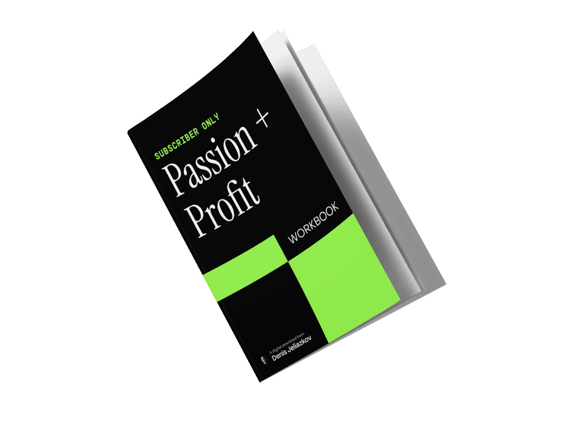
The Profit + Passion Workbook gives you a step-by-step action plan to go from struggling freelancer to an in-demand professional with total freedom. 😎
Build
🤝 A steady stream of inbound leads and referrals
💡 A personal brand that attracts high-paying clients
📈 A portfolio that converts interest into booked projects
💰 A pricing strategy that breaks you out of the low-budget trap
Inside, you’ll get:
• Step-by-step exercises
• Plug-and-play templates for fast action
• Good & bad examples (so you avoid mistakes)
Get instant access—just drop your email below.
(Just promise me you’ll do the exercises… or else...)