
When you want to spice up things there are countless websites for you to select the right typeface, but we as digital designers need to think about the user experience as well. We need to provide continuous experience from end to end.
1. Pick a context
Before we even consider what fonts to use make sure your content is written well. No matter what font you select it won’t save a bad copy. If you work on typography it will just draw the user’s focus to the content, so make sure it’s clear and effective.

2. Focus on creating contast
When working with multiple fonts it’s essential to establish hierarchy of the elements. The visual difference needs to be obvious enough so customers can immidiately understand the importance of every single element.

Sometimes the best way to pair fonts is actually to go the safe route and use just 1 family. You can have a different weight from the same font and it will provide high contrast while maintaining visual harmony.

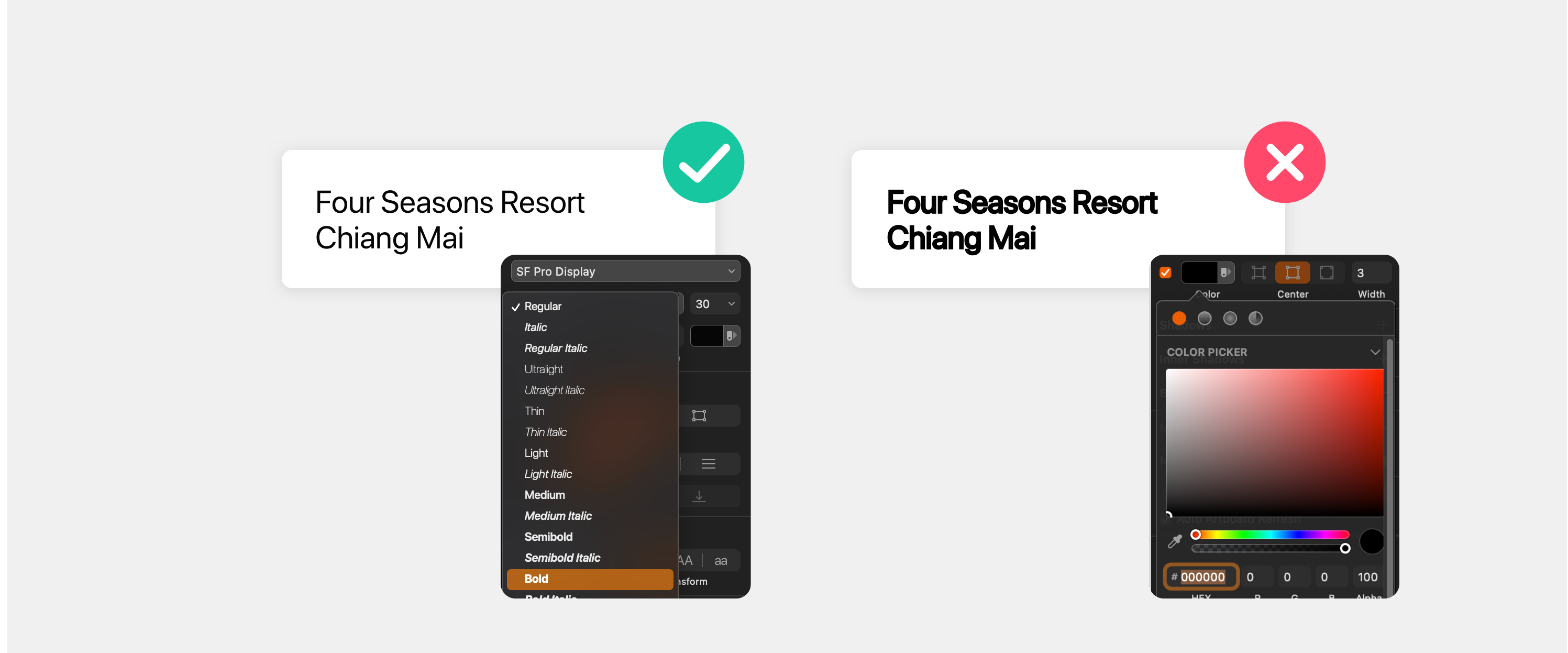
We are talking a lot about contrast, but too much contrast is bad. It looks unbalanced in large block of texts. They can work only with logos or minimalistic usage of fonts. You should also consider that if your font doesn’t have bold, don’t bolden it inside CSS or adding a stroke to it. It’s designed a certain way and if there isn’t bold it won’t look natural.
3. Pick a personality
You have brand guidelines, so try and use those to determine the personality of the font or fonts you want to use.
Try and pair your main font with a more neutral one to establish a visual hierarchy and avoid the attention battle.

Avoid fonts with conflicting personalities and avoid the thinking that more unique is better for the business. Don’t use fonts that wacky just because they are “fun”.
As designers it’s very important to understand that font pairing is very subjective. It’s vital that we go and explore different pairings and test ourselves what actually works best.
🎁 3 Best Font pairing tools: