
What is a type scale?
It’s basically a progression of font sizes going from low to high and it represents font sizes. It can start from your smallest font (captions 12px) to your biggest one (H1 – 40px) as an example)
An easy trick to define your type scale is the ratio as it defines the difference between your font sizes.
We’ll use Major Second Increments for example, and in it, every font needs to. be with a ratio of 1.125. So if your paragraph is 16px how much should be your next size?

You just multiply or divide your font size based on the size of the previous one. So if my base size for a paragraph is 16 multiplied by 1.125 will equal 18.
However, in some of the scales you can with weird numbers such as 21.33, don’t leave it like that. Round it up either up or down.
But wait, this isn’t the only type of scale. I think the others we can split them into 3 categories:
- Low contrast
- Medium contrast
- High contrast
Let’s go over the three categories and talk over the scales so you can notice the difference.
Low contrast
Minor Second (1.067) and Major Second (1.125)
These two scales are very linear scales and their font sizes progress at a consistent rate.
I think these scales are the most suitable for heavy data dashboards, apps, or websites because they allow your content to be more flexible.
More flexible? Not that it doesn’t do yoga, but you can fit more content on your screen.

Medium contrast
Minor Third (1.200), Major Third (1.125), Perfect Fourth (1.333)
Moving up a notch we are coming to Minor Third as the first next scale from the medium contrast ones. It’s a more linear scale, but you can clearly see it’s a much bigger difference in each font size.
Major Third has an even bigger difference in font sizes compared to Minor Third.
Perfect Third is maybe the most popular one out there as it creates a very clear contrast between font sizes, whilst also being quite balanced.
These medium contrast scales I won’t use these on products (dashboards and apps) but will use them on websites.

High contrast
Golden Ratio (1.618), Perfect Fifth (1.500), Augmented Fourth (1.414)
Golden ratio, Perfect Fifth and Augmented Fourth have the biggest difference when it comes to font sizes.
These three I use ONLY for marketing or creative websites.

When to use what?
According to this article from FreeCodeCamp, you should split your projects into 3 types:
- Marketing sites
- Informational sites
- Product
When you analyze it, you’ll quickly realize that certain types of scales are much better suited for certain archetypes.
If your website is a marketing one your goal is to present a product or a service and to convert visitors into customers.
On these websites, we need to grab users’ attention with a larger heading and display informational content. Which means we should use….???
High contrast scales, you got that right!
Now, open Medium.com – what scale do they think they use?
Medium contrast, no pun intended.
They are best used on websites where you need to read a lot and in order to avoid high contrast between sizes making it look more coherent.
If we want to display products (dashboards) as mentioned above it will be best to use the low contrast or more linear ones.
This is because they don’t need as big of a contrast as the other two and focus on usability more, than on displaying information.
However, the best designers mix and match. You shouldn’t only use one or the other and you should always try to mix and match what feels the best for your project.
Making it responsive
Everything until now has been all about type scales, and this email promised to be about making it responsive. We are getting there.
In order to make a scale responsive easily you have two options:
- Use the same base font size, but change the scale on each breakpoint
- Use the same scale, but change the base font size on each breakpoint
Considering everything in the design is about consistency, I prefer the second option as it makes more sense to me.
You can quickly see that if you change your base font to a lower one, it will alter the entire scale.

Well, yeah that sounds great but I don’t want to be that nerd that constantly plays with type scales.
Don’t worry there, I got you covered.
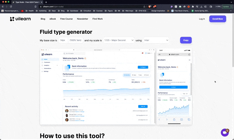
I built Type Scale to help you easily preview your scales on dashboards and apps.
Quickly copy them to Figma and be called a Type God.
![]()
All you need to do after using the tool is look for the weird type numbers as some scales can get minor increments.