Is there a difference when you eat chocolate bars from different chocolate brands?
Most people aren’t so obsessed with chocolate bars that they can taste huge differences between different chocolate brands.
The same goes for the different typefaces in UI design!
Many beginner designers might not see the difference in using specific typefaces for certain user interfaces, but it’ll look weird when the font doesn’t match the UI.
Just like how you probably have a certain go-to chocolate brand although “all chocolate tastes the same” – because it just feels right.
We all love Inter and the new Geist from Vercel, I get it.
But what other options do you have for designing modern interfaces that are scalable and readable?
To answer the question of what are the best fonts for modern UI… I decided to ask my community over Twitter, to recommend me new typefaces, and collected the 5 most mentioned ones into this blog!
Choosing the right fonts
To establish a robust typography system, your initial step is selecting the right font family. Each year, a flood of new typefaces enters the scene, making the choice for your project a daunting task.
Here’s the reality: it’s wise to disregard a whopping 99% of these fresh fonts. This may sound like an exaggeration, but the truth is, that the majority of modern fonts are of subpar quality, often mere variations of popular font families aimed at quick profits.
If you’re new to design, start with classic, reliable fonts like neutral sans-serif typefaces. They’re a safe choice until you gain more experience. While it’s tempting to experiment with various fonts, especially combinations like serif and sans-serif, it can be tricky.
For beginners, simplicity is key, so stick with the fonts recommended in this post.
Manrope
A perfect font to replace your traditional fonts. It has 7 weights (albeit no italic).
What I’ve noticed from using Manrope is that it’s a thinner font, so when you get to lower sizes you’ll need to increase the thickness, but I’ve also noticed that I don’t use that much regular with it (mostly Medium or Bold).
The letterforms are a little bit more compact, which could often mean that you need to use a slightly larger font size to make it more readable.
Get Manrope 👉 here
Aeonik
Aeonik is a really well-designed grotesque typeface.
If you are looking for sharper edges and geometrical font this might be your new love. The most noticeable characters are the ‘f’, ‘j’, and ‘t’ which feature 90-degree turns and straight outstrokes.
Aeonik is very versatile and highly legible, however, this comes at a cost as the licenses might be out of reach for certain organizations and designers.
Get Aeonik 👉 here (starting at $120)
Satoshi
If you are looking for a more geometrical and grotesque font – Satoshi is the right one for you.
Satoshi is also a bit narrower than Inter or SF Pro and it also lacks italics. It’s a very good alternative to the widely loved Circular (which is a paid font).
What I don’t like about it is that you always need to have uneven spacing on top and bottom as it has a higher line height, which easily makes your elements visually not centered.
Get Satoshi 👉 here
Work Sans
Work Sans is an ideal type choice for modern user interfaces because of its simplicity and readability, making it well-suited for both body text and headlines in digital environments.
Work Sans has a very “relaxed” spacing, which allows the letterforms to breathe unlike Manrope or Satoshi when they are closer together.
I really like the “g”, and the tail on the “a” that it gives.
If you decide to use it, be mindful that this font will feel “heavier” so you might want to go down a bit on font sizes and weights, and maybe even play with the kerning.
One more limitation of Work Sans is its relatively limited character set and language support, which may be a drawback for projects that require extensive multilingual or special character usage
Get Work Sans 👉 here
IBM Plex Sans
IBM Plex Sans is a fantastic choice for modern user interfaces due to its exceptional legibility, open letterforms, and generous spacing, enhancing readability on screens.
Its extensive language support and comprehensive set of styles, including multiple weights and italics, provide designers with a wide range of options for creating visually appealing and adaptable user interfaces.
However, one potential downside of IBM Plex Sans is that it may lack a distinctive and unique personality compared to some other contemporary typefaces, which could make it less suitable for brands or projects seeking a more individualistic and memorable typographic identity.
Other typefaces
There are a lot of other typefaces that didn’t make the cut, as I think they are widely known and used such as Figtree, Graphik, Helvetica, Poppins, Nunito, and Gilroy.
Good practices when using any new fonts:
With any new font that you are not familiar with a great way to start working with it is setting some boundaries.
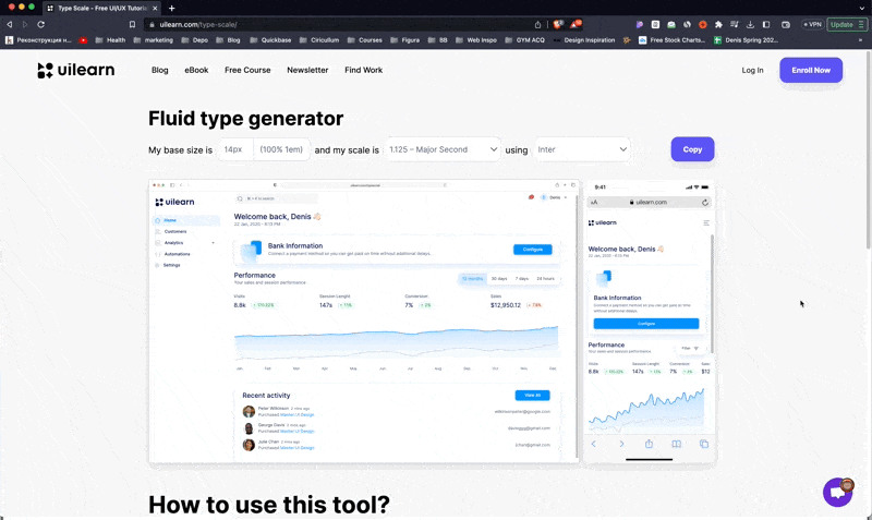
The best way for you to create that scale is by hand, and this will be the easiest way. I always advise you to start with the main paragraph size and take it from there, but thanks to tools you can now create it with a single click.
In interface design, our sole goal is to make the content readable and consistent system for a user to learn and understand.
Starting with some limitations can help you design better interfaces – faster.
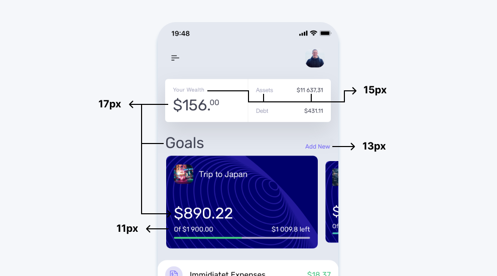
For example, as of iOS 17 the type sizes would be as follows:
- Titles & Actions = 17px
- Subtitles & Body Copy = 15px
- Secondary Actions = 13px
- Metadata = 11px
In the quest for the perfect fonts in your UI design, it’s tempting to mix and match. Maybe you’re torn between a couple of stellar fonts or considering a blend of serif and sans-serif?
But here’s the deal – keeping it simple with just one typeface is a smart move. Multiple fonts can turn your design into a chaotic clutter fest. If you absolutely must, stick to two fonts max. Often, modern fonts offer a range of weights, giving you the versatility you need.
So, whether you choose one or two fonts, remember, less is often more when it comes to effective design.
It’s important to note that the rule of four can be extended by changing other aspects of the type. Each of these changes can effectively change the meaning of that particular piece of the interface.
This post is an excerpt from Master UI Book, the eBook that helps you design better and scalable interfaces – faster.
And guess what?
By getting this eBook, you’re not just learning about typefaces. You’re also getting the sauce for all UI elements, as well as how to take your skills to the next level!
You’ll basically get everything you need to know about UI design (including the designer mindset) to crush it for your projects and your career.
As a beginner, it’ll be much easier to just get as much knowledge as possible so you don’t have to go through years of struggling and suffering (like I did). And I’m basically giving you what I’ve learned in the past 10+ years all in one single book.