
When it comes to creating high-quality products, all of the small details are crucially important.
1. Ignoring Scope/Bad Planning
How often have you used a product that has Lorem ipsum in it and stock photos? None.
If you want to level up your skills design something that might be the end-case of the product. What images will it actually feature, how long could the titles be. Your beautiful design will be broken once it’s been filled by the real content.
Specifically, before you start working on a UI design, you need to know what kind of content will be shown in each and every section of the page. You also need to know the minimum and maximum sizes of the content. These turning points are called edge cases because they show when and how the interface will change.
Selecting Images
You’ll also want to investigate image limitations. If your client doesn’t have any custom photos or isn’t going to purchase any, there’s no sense in using beautiful but pointless photos from Unsplash.
Why? Photos tend to be conceptual. It’s not enough to use something pretty. Instead, you need to select images that create a narrative or simply a deeper meaning.
Whatever you do, don’t use photos that don’t need to be there. These days, people become overwhelmed by huge amounts of information. One extra bit of useless visual information will only irritate them.

Understanding Repeating Blocks
Another edge case is related to repeating blocks — for example, image + text, icon + text, number + text, and so on. You should think about how these blocks will look with two lines of text and with ten, as well as if they’ll stand one by one.
For small text blocks that describe features, you can easily use a three-column layout. However, if you have more than five lines of text and you need to show it all without ellipses, you have to come up with another visual solution. Why? Because reading long columns of text is good only for newspapers, and not convenient for the web. Possible solutions could include using slides with horizontal scrolling or a two-column layout.
Planning for Scaling
Knowing your content’s edge cases will help you use screen space more efficiently and choose the right UI treatment for each piece of the interface. But keep in mind that edge cases aren’t only about what you have currently. A good designer should always think proactively, allowing for the possibility clients may need to scale the UI in the future.

2. No difference between primary and secondary actions

When working with apps, you will have many actions that the user is able to complete. It is important to give visual importance to the primary actions. All the navigation happens through buttons, so you have to make it easy for the user to identify the primary buttons by making them bold and prominent. Secondary actions should be less prominent but still visible if the user is looking for them.
Here’s how to distinguish between primary and secondary buttons:
- Use different visual weights for primary and secondary buttons. The button with the strongest visual weight will get more attention.
- So use strong colors, bold text, and size to give visual weight to primary buttons. Do the contrary for secondary actions.
3. Frustrating error states
When you’re designing a user interface, don’t forget the main purpose of any user interface: to provide as smooth as possible an interaction between the user and the service. Interfaces are no place for doubts, questions without answers, or any kind of uncertainty.
Designers should provide clear feedback to users about states, especially in the case of error states. Accordingly, error notifications should satisfy the following simple rules:
- They should be recognizable and noticeable (e.g., the color red is a common UI pattern indicating an error).
- They should clearly explain what has happened and how users can fix the error.
- They should be contextual. It’s better to show error messages near the element they relate to.
- They should not be irritative. Isn’t your user already irritated enough by the error?
Designers should also take care of unexpected errors (e.g. server errors, page not found). Any error message is an obstacle to the user’s flow. That’s why we need to help the user handle it, provide any possible solutions, and try to smooth out a bad experience — especially if it’s not the user’s mistake. For example, a good solution may be to design illustrations or animations for 404 and 500 pages.
Being Careful with Form Checks
When designing error states, try your best not to annoy your users. In particular, be careful with all possible kinds of form checks.
For example, imagine you have a form with required fields. That means developers have a corresponding check, “All required fields shouldn’t be empty.” Let’s say the user tries to fill in the form, but in random order. When the first required field loses the focus state, it returns an error: “Please fill in this field. It is required!”
Our poor user is exclaiming, “Hold on, mate, I’m just clicking between the form fields and haven’t even clicked on ‘Submit’!” And things can even get worse. For example, let’s say you have another check, and the “Submit” button will become disabled until all required fields are no longer empty.
Just think about it for a second. Your poor user didn’t do anything and isn’t able to submit the form, but you’ve already blamed several mistakes on him. This will definitely piss off anybody, so it’s best to avoid such situations.
Weighing Cost and Value
Don’t listen to developers who try to tell you it will cost a high level of effort to implement in the way you want. Remember: NOT avoiding this problem will cost you customers! Nobody needs a service or product without customers. Even if it was cheap to develop.

4. Poor alignment
I’ll admit it, I’m an alignment freak. But that’s only because once you discover the power of aligning things, you realize that it is the key to making any layout look beautiful and balanced.
Many designers think using a grid can restrict your creativity, and in a way, it is true. However, if you are just starting out as a UI designer, I believe it is necessary to first learn the rules before you break them.
Proper padding and spacing keep your layout looking clean and orderly while making it easier for readers to read and understand information.
Same-size spaces should be set around logical blocks (e.g., at the top and bottom, and on the left and right sides). If the spaces are uneven, your page will look messy, and users may not give equal consideration to each section.
Padding that’s too small means users can’t break down content into logical blocks. To keep logical parts from blending together, keep them separate and insert a large space between them.
An easy way to maintain visual hierarchy is to follow this simple rule: The padding between different logical blocks should be larger than the padding between the heading and text inside of each block. For example, say you have a long block of text that includes headings, subheads, and paragraphs:
- Set the heading padding-bottom to 40px, then follow it with a paragraph of text.
- Set the paragraph padding-bottom to 10px.
- If there’s a subhead after the paragraph, give it 30px for padding-top (i.e., the space between the paragraph and the top of the subhead will be 30px) and 20px for padding-bottom (i.e., the space between the subhead bottom and paragraph will be 20px, which is larger than the space between the paragraphs).
That will put the desired emphasis on the most important and biggest elements. The largest text — the heading — has a larger space around it. But this space should be closer to the related elements that follow it.

5. Low Contrast
Designing a product is similar to building a public building like a library or a school — it needs to be inclusive to all. That includes blind, color blind, and visually impaired users.
Just ask Domino’s, they were sued by a blind man who could not access their website because it wasn’t accessible. Don’t be like Domino’s, design for accessibility.
Often we’re trying to design what looks good and neglect to consider the different users that will be interacting with our product.
As I’ve matured as a designer, I’ve come to terms with all the various constraints that will undermine my idea of a perfect design. ADA compliance is one of such constraints.
Shrinking text down to 8px because it fits our horizontal space better or using a light shade of grey because it looks nice is neglecting our vision-impaired visitors.
We can get away with this when we’re trying to score Dribbble likes, but it’s not a good practice when developing a product for real humans.
Web Content Accessibility Guidelines (WCAG) requires at least 4.5:1 contrast. There are also guidelines for motor, auditory, and cognitive disabilities.
To ensure you’re meeting these standards, download Stark which will check if your designs are accessible or not.

Using White Space
That said, if you place two completely different elements very close to each other, the user won’t understand which element is the “main” one. That’s why we can say that contrast isn’t just about applying different visual styles to elements, but also about the art of using white space. This is because, sometimes, to make elements contrast, you need to separate them with blank space.
White space is important to make your content easy for users to read. Of course, white space can be used improperly: having too much blank space or cramming too much content into a small area. Many websites with excessive advertisements also lack sufficient white space.

Ensuring Sufficient Contrast Between Text and Images
Avoid low contrast for text copy placed on an image. There should be sufficient contrast between the text and the background. To make copy prominent, place a contrasting filter over the image. Black is a popular color, but you can also use bright colors, mixing and matching them.
Another option is to use a contrasting image from the start. In this case, you can place the copy on top of a dark section of the photograph or image.
6. Poor Iconography
Icons are incredibly useful when you need to express meaning via a small symbol or to briefly illustrate a description. They’re also a fundamental part of modern interfaces, especially on mobile.
In applications, icons are often the equivalent of buttons. Just check out Instagram: You’ll see only icons and text.
That’s why it’s very important to select the right visual image to correspond to an element’s meaning. Sounds simple, right? Nope. It’s extremely painful to find the right icons, but that’s why I cover this in one of our lessons in the full course.
You need to tell the story using very simple and common images that will be understandable to everyone. And you need to match these icons with the overall style of the UI. Then, you need to provide them to developers in SVG format.
Maybe you’ve searched for free icons, and you were thrilled when you found a nice image for each element. You think, how perfectly they correspond to each other! They will be understandable to everyone! Sadly, somehow, the overall impression of the icon set you’ve selected feels rather messy and untidy. How can you avoid this kind of messiness? Here’s a short checklist for you:
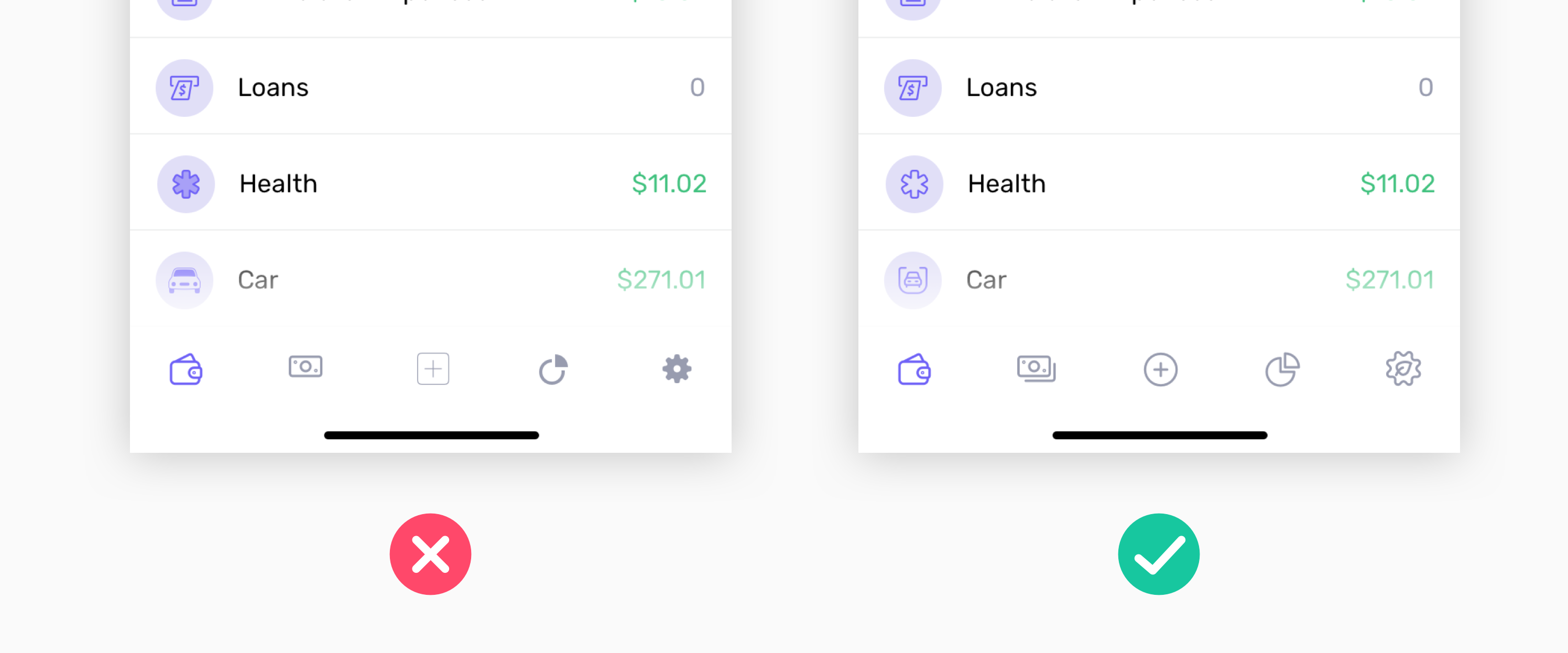
- Line width — After resizing, all of your icons should have equal line width. Otherwise, it will be very noticeable that they don’t.
- Corner radius — If your icons include some rectangular shapes, compare the corner radius of every icon in your set. If it’s different for different icons, you’d better fix it.
- Line cap shape (for outlined icons) — It can be rectangular or rounded.
- Corners join shape (for outlined icons) — It can be rectangular or rounded.
It’s true that unsophisticated users may not specifically notice different line widths or corner radiuses. Still, the overall impression will be wrong, and the users will feel it.
In other words, while it’s not wrong to use free icons, it’s best to go easy on them. Using free icons makes a project look cheap and, in some cases, unprofessional. Plus, there are plenty of free icons out there that people will recognize instantly. Why? They’ve already seen them used everywhere.
That’s why my advice is to be strictly selective with free icons or — even better — design icons yourself. Custom icons always provide a superior experience.
7. Not thinking cross platform
Yes, ideally, this should no longer be a problem in today’s world.
We all know that most users access web services from mobile devices. Unfortunately, many designers still have a tendency to forget that fact. (Or maybe it’s that clients don’t want to fork over the money to create mobile-optimized designs?)
For design professionals, however, the problem of not optimizing for multiple devices shouldn’t occur. When creating a UI, you always should keep in mind the widely lauded “mobile-first” approach.
Concentrate on the content that every type of user will see on each page. Then, ask yourself, “Is the UI control I selected for displaying this particular content convenient or not?”
You may choose a nice UI element that will work perfectly on desktop devices — but it won’t be great for smartphone users. Or vice versa. That’s why it’s important to always keep in mind the wide variety of devices we must design for nowadays.

Poor touch areas
Small touch targets are frustrating because they can make it difficult for the user to complete their desired action. We’ve all experienced the frustration of tapping the wrong button on our smartphone and having to wait while the wrong screen loads!
So, when designing clickable elements, remember that users come equipped with different sized fingers:
- Create finger-friendly targets by keeping in mind that the average width of an adult index finger is 1.6 to 2cm.
- Make your touch target at least 45-57 pixels wide. This will give users enough room to hit the target without having to worry about accuracy.

There are plenty more rules for “speaking interface” that I cover in my video course UI Learn, but these are some of the ones that I’ve used the most over the years. If you like these, check out more of my design writing on the Design Newsletter, where I send occasional, original design writing.